
![]()
I make mistakes. Sometimes I learn from them.
One of the learnings is that you shouldn’t put too a too restrictive scope to any creative activity. Such as writing a blog. So what’s the point of placing the walls around the cross-section of competitive strategies and user experiences?
The scope of “Competitive Experiences” was all too tight. “Competitive?” C’mon, I am not even a competitive personality but a co-operative one. I enjoy nature, good books, creative discussions in multitalented networks,… During the past year, there have been many times that I might have posted something interesting – at least interesting to myself – but it did not fit into the scope of competitive strategy. On the other hand, I did not want to open new blogs because even this first one grows pretty slowly.
The solution is naturally simple. I change the name. This time I try to make the scope wide enough. “Experiences by Jussi” should do. Simple like that.
Oops. I almost forgot. Let’s change the logo too. Like this:
![]()
I also trimmed my favourite slogan to Design is perfect when there is nothing to take away. Here’s the story of this slogan.
Now, is the logo perfect? Of course it isn’t. Nothing is, if you ask a perfectionist like me.
The guidance of the engineer Antoine de Saint-Exupéry anyway helped me to remove some unnecessary parts. I’ll walk you through my experience of drawing it.
![]()
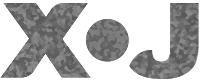
Designers – at least some of them – advise that one should never show the bad draft versions. That is, one should impress the audience by showing only the polished outcome. Well, I am not a designer but an engineer. Thus I can show my own imperfection. Here’s the previous version of the logo
and the corresponding favicon ![]()
This first clumsy logo – shown above – was drawn quickly with Photoshop on my MacBook, and I was happy enough with it. It might well have ended like that.
![]()
For some reason, I had not yet saved the above graphics on the cloud when I was pulled to something else. Taking out the dog, or taking the TV off the wall which my wife was just painting. Or something. Coming back, my son had taken the MacBook to minecraft something huge. So I had to take another device, and sketch the logo from scratch again.
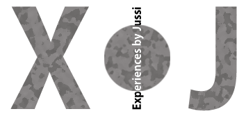
At this time this came out.
I thought I was simply recreating the logo based on my memory. Changing the character widths so dramatically was not a conscious decision – my brain just processed the vision differently this time.
Leaving out the vertical text was a conscious decision. I thought the vertical line could disturb the interpretation of “by”, i.e. the multiplication sign.
I consider myself as a soft person. That’s why I then rounded the J at the left. This way it also touched the middle dot more smoothly. The rounding of the J led me to consider rounding the X too. Experiences differ: some are soft, some are hard. Let the differently shaped parts of X express that.
A disturbing interpretation: Is the J is playing football with the ball, kicking it to the middle of experiences? Makes no sense. Problem: once I say this idea aloud, you’ll see it. It sticks like an earworm. Sorry 🙂
And finally, as my aim is to discuss and reflect the real world, I textured it all with the Sponge filter. The look now associates also to nature and natural materials.
Or does it? Now being grey, it resembles steel. That is not quite what I want. However, if I turn it to green, I create new meanings. I would like this logo to remain neutral.
But what if I still try… And surprise. I like it in green. No problem with the various meanings created by green. Most of my experiences are positive and natural anyway.
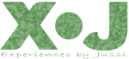
Finally, I added the text. That sounds like a dangerous move. Firstly, adding something to a design usually adds to complexity, and that is very seldom nothing but stupid.
Secondly, some may interpret it as an explanation. “Does the guy think I am not intelligent enough to understand it without that explainatory text?” No, the text is not there to explain anything. I simply wanted to bring in the hand-written words. For the sake of having words written by hand. A blog is most of all about writing and words.
The text line also associates to the typical placement of company promises below company logos. Their purpose is to summarize the key promise stated by the brand. My promise is to write about true experiences I have had. In this case, the meanings expressed by the logo above (the X●J) and the text line below happen to be deliver the same message. I consider that not as a problem but as a strength.
Anyway, as typical with brand graphics, the logo will mostly appear alone, without the text line of brand promise. In my case, the logo + text shall be shown together only in the header of the blog opening page.
Now I just need to add the corresponding favicon:
![]()
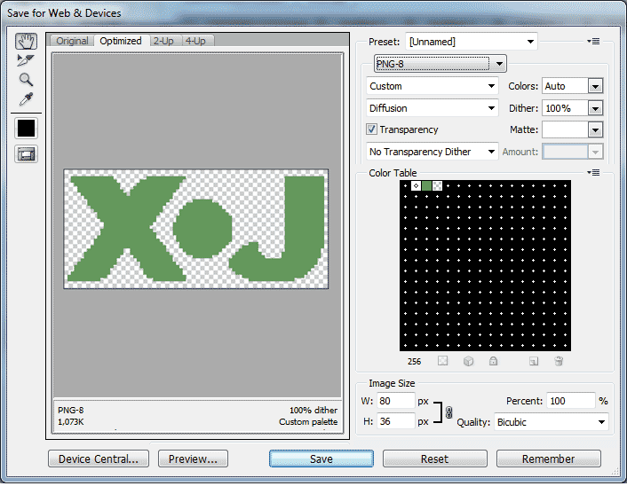
I am an old-school man, so I aim at saving colors and cutting file sizes to serve also those with narrow bandwidths. For this, 4 colors seem to be more than enough. The file size remained above 1 kbit, but I guess your 4G bandwidth will handle it fast enough.
I tiny problem left. Favicons should be squares. Any other proportion becomes distorted. I guess you already noticed that. But hey, the world out there is imperfect, so let also this favicon express that. What did I say: World is imperfect? Past? Who’s designing this language called English? If you know, please comment.
![]()
Your comments will appear here
as soon as I have read them.
The delay is for filtering out the spam sent by bots.
Pingback: Click here for shortcuts to all posts | Experiences by Jussi